Qt quickをサンプルプロジェクトから学ぶ
背景
Qt Quick、QMLを学習したいが参考書籍やYoutube動画が少ない。サンプルプロジェクトのGalleryがためになるという情報を入手したのでコードを閲覧しまとめる。
サンプルプロジェクト
今回ソースコードを確認するサンプルプロジェクトは、Qt Creatorを立ち上げ後にExampleから選択可能。

プロジェクトをビルドすると以下のようなwindowが表示される。

左上のハンバーガーメニューをクリックすると各コンポーネント名が表示される。

コンポーネントを選択しクリックすると、コンポーネント名に応じた画面が表示される。
以下はButtonを選択した場合の画面。

サンプルプロジェクトなので、当然全てのコードが閲覧可能である。従って各コンポーネントの記述方法・プロパティなどが確認できる。
ファイル構成
プロジェクトのファイル構成は、メイン画面となるgallery.qmlと各コンポーネント用にcomponent名.qmlがpageディレクトリに収められている。
gallery.qmlのコードは以下の通り。
import QtQuick
import QtQuick.Layouts
import QtQuick.Controls
import Qt.labs.settings

import "." as App

ApplicationWindow {
    id: window
    width: 360
    height: 520
    visible: true
    title: "Qt Quick Controls"

    function help() {
        let displayingControl = listView.currentIndex !== -1
        let currentControlName = displayingControl
            ? listView.model.get(listView.currentIndex).title.toLowerCase() : ""
        let url = "https://doc.qt.io/qt-5/"
            + (displayingControl
               ? "qml-qtquick-controls2-" + currentControlName + ".html"
               : "qtquick-controls2-qmlmodule.html");
        Qt.openUrlExternally(url)
    }

    required property var builtInStyles

    Settings {
        id: settings
        property string style
    }

    Shortcut {
        sequences: ["Esc", "Back"]
        enabled: stackView.depth > 1
        onActivated: navigateBackAction.trigger()
    }

    Shortcut {
        sequence: StandardKey.HelpContents
        onActivated: help()
    }

    Action {
        id: navigateBackAction
        icon.name: stackView.depth > 1 ? "back" : "drawer"
        onTriggered: {
            if (stackView.depth > 1) {
                stackView.pop()
                listView.currentIndex = -1
            } else {
                drawer.open()
            }
        }
    }

    Shortcut {
        sequence: "Menu"
        onActivated: optionsMenuAction.trigger()
    }

    Action {
        id: optionsMenuAction
        icon.name: "menu"
        onTriggered: optionsMenu.open()
    }

    header: App.ToolBar {
        RowLayout {
            spacing: 20
            anchors.fill: parent

            ToolButton {
                action: navigateBackAction
            }

            Label {
                id: titleLabel
                text: listView.currentItem ? listView.currentItem.text : "Gallery"
                font.pixelSize: 20
                elide: Label.ElideRight
                horizontalAlignment: Qt.AlignHCenter
                verticalAlignment: Qt.AlignVCenter
                Layout.fillWidth: true
            }

            ToolButton {
                action: optionsMenuAction

                Menu {
                    id: optionsMenu
                    x: parent.width - width
                    transformOrigin: Menu.TopRight

                    Action {
                        text: "Settings"
                        onTriggered: settingsDialog.open()
                    }
                    Action {
                        text: "Help"
                        onTriggered: help()
                    }
                    Action {
                        text: "About"
                        onTriggered: aboutDialog.open()
                    }
                }
            }
        }
    }

    Drawer {
        id: drawer
        width: Math.min(window.width, window.height) / 3 * 2
        height: window.height
        interactive: stackView.depth === 1

        ListView {
            id: listView

            focus: true
            currentIndex: -1
            anchors.fill: parent

            delegate: ItemDelegate {
                width: listView.width
                text: model.title
                highlighted: ListView.isCurrentItem
                onClicked: {
                    listView.currentIndex = index
                    stackView.push(model.source)
                    drawer.close()
                }
            }

            model: ListModel {
                ListElement { title: "BusyIndicator"; source: "qrc:/pages/BusyIndicatorPage.qml" }
                ListElement { title: "Button"; source: "qrc:/pages/ButtonPage.qml" }
                ListElement { title: "CheckBox"; source: "qrc:/pages/CheckBoxPage.qml" }
                ListElement { title: "ComboBox"; source: "qrc:/pages/ComboBoxPage.qml" }
                ListElement { title: "DelayButton"; source: "qrc:/pages/DelayButtonPage.qml" }
                ListElement { title: "Dial"; source: "qrc:/pages/DialPage.qml" }
                ListElement { title: "Dialog"; source: "qrc:/pages/DialogPage.qml" }
                ListElement { title: "Delegates"; source: "qrc:/pages/DelegatePage.qml" }
                ListElement { title: "Frame"; source: "qrc:/pages/FramePage.qml" }
                ListElement { title: "GroupBox"; source: "qrc:/pages/GroupBoxPage.qml" }
                ListElement { title: "PageIndicator"; source: "qrc:/pages/PageIndicatorPage.qml" }
                ListElement { title: "ProgressBar"; source: "qrc:/pages/ProgressBarPage.qml" }
                ListElement { title: "RadioButton"; source: "qrc:/pages/RadioButtonPage.qml" }
                ListElement { title: "RangeSlider"; source: "qrc:/pages/RangeSliderPage.qml" }
                ListElement { title: "ScrollBar"; source: "qrc:/pages/ScrollBarPage.qml" }
                ListElement { title: "ScrollIndicator"; source: "qrc:/pages/ScrollIndicatorPage.qml" }
                ListElement { title: "Slider"; source: "qrc:/pages/SliderPage.qml" }
                ListElement { title: "SpinBox"; source: "qrc:/pages/SpinBoxPage.qml" }
                ListElement { title: "StackView"; source: "qrc:/pages/StackViewPage.qml" }
                ListElement { title: "SwipeView"; source: "qrc:/pages/SwipeViewPage.qml" }
                ListElement { title: "Switch"; source: "qrc:/pages/SwitchPage.qml" }
                ListElement { title: "TabBar"; source: "qrc:/pages/TabBarPage.qml" }
                ListElement { title: "TextArea"; source: "qrc:/pages/TextAreaPage.qml" }
                ListElement { title: "TextField"; source: "qrc:/pages/TextFieldPage.qml" }
                ListElement { title: "ToolTip"; source: "qrc:/pages/ToolTipPage.qml" }
                ListElement { title: "Tumbler"; source: "qrc:/pages/TumblerPage.qml" }
            }

            ScrollIndicator.vertical: ScrollIndicator { }
        }
    }

    StackView {
        id: stackView
        anchors.fill: parent

        initialItem: Pane {
            id: pane

            Image {
                id: logo
                width: pane.availableWidth / 2
                height: pane.availableHeight / 2
                anchors.centerIn: parent
                anchors.verticalCenterOffset: -50
                fillMode: Image.PreserveAspectFit
                source: "images/qt-logo.png"
            }

            Label {
                text: "Qt Quick Controls provides a set of controls that can be used to build complete interfaces in Qt Quick."
                anchors.margins: 20
                anchors.top: logo.bottom
                anchors.left: parent.left
                anchors.right: parent.right
                anchors.bottom: arrow.top
                horizontalAlignment: Label.AlignHCenter
                verticalAlignment: Label.AlignVCenter
                wrapMode: Label.Wrap
            }

            Image {
                id: arrow
                source: "images/arrow.png"
                anchors.left: parent.left
                anchors.bottom: parent.bottom
            }
        }
    }

    Dialog {
        id: settingsDialog
        x: Math.round((window.width - width) / 2)
        y: Math.round(window.height / 6)
        width: Math.round(Math.min(window.width, window.height) / 3 * 2)
        modal: true
        focus: true
        title: "Settings"

        standardButtons: Dialog.Ok | Dialog.Cancel
        onAccepted: {
            settings.style = styleBox.displayText
            settingsDialog.close()
        }
        onRejected: {
            styleBox.currentIndex = styleBox.styleIndex
            settingsDialog.close()
        }

        contentItem: ColumnLayout {
            id: settingsColumn
            spacing: 20

            RowLayout {
                spacing: 10

                Label {
                    text: "Style:"
                }

                ComboBox {
                    id: styleBox
                    property int styleIndex: -1
                    model: window.builtInStyles
                    Component.onCompleted: {
                        styleIndex = find(settings.style, Qt.MatchFixedString)
                        if (styleIndex !== -1)
                            currentIndex = styleIndex
                    }
                    Layout.fillWidth: true
                }
            }

            Label {
                text: "Restart required"
                color: "#e41e25"
                opacity: styleBox.currentIndex !== styleBox.styleIndex ? 1.0 : 0.0
                horizontalAlignment: Label.AlignHCenter
                verticalAlignment: Label.AlignVCenter
                Layout.fillWidth: true
                Layout.fillHeight: true
            }
        }
    }

    Dialog {
        id: aboutDialog
        modal: true
        focus: true
        title: "About"
        x: (window.width - width) / 2
        y: window.height / 6
        width: Math.min(window.width, window.height) / 3 * 2
        contentHeight: aboutColumn.height

        Column {
            id: aboutColumn
            spacing: 20

            Label {
                width: aboutDialog.availableWidth
                text: "The Qt Quick Controls module delivers the next generation user interface controls based on Qt Quick."
                wrapMode: Label.Wrap
                font.pixelSize: 12
            }

            Label {
                width: aboutDialog.availableWidth
                text: "In comparison to Qt Quick Controls 1, Qt Quick Controls "
                    + "are an order of magnitude simpler, lighter, and faster."
                wrapMode: Label.Wrap
                font.pixelSize: 12
            }
        }
    }
}
中腹にある以下のコードで別ファイルのコードを呼び出している。
ListVIew{
    model:ListModel{
        ListElement { title: "Button"; source: "qrc:/pages/ButtonPage.qml"}
}
各種コンポーネント
頻繁に使うことが予想されるコンポーネントについて説明する。 ここでは、以下について説明する。 1. Button 1. CheckBox 1. ComboBox 1. DelayButton 1. Slider 1. Switch 1. TextField
Button
コードは以下。
import QtQuick.Layouts
import QtQuick.Controls

ScrollablePage {
    id: page

    Column {
        spacing: 40
        width: parent.width

        Label {
            width: parent.width
            wrapMode: Label.Wrap
            horizontalAlignment: Qt.AlignHCenter
            text: "Button presents a push-button that can be pushed or clicked by the user. "
                + "Buttons are normally used to perform an action, or to answer a question."
        }

        ColumnLayout {
            spacing: 20
            anchors.horizontalCenter: parent.horizontalCenter

            Button {
                text: "First First First"
                Layout.fillWidth: true
            }
            Button {
                id: button
                text: "Second"
                highlighted: true
                Layout.fillWidth: true
            }
            Button {
                text: "Third"
                enabled: false
                Layout.fillWidth: true
            }
        }
    }
}
ここではColumnLayoutを用いてボタンを3つ並べているが、Buttonコンポーネント自体は以下のような記述で表示できる。
Button {
    id: button
    text: "Second"
    highlighted: true
    enabled: true
    Layout.fillWidth: true
}
ButtonではなくRoundButtonとすれば丸みを帯びたボタンになる。

CheckBox

コードは以下。
import QtQuick
import QtQuick.Controls

ScrollablePage {
    id: page

    Column {
        spacing: 40
        width: parent.width

        Label {
            width: parent.width
            wrapMode: Label.Wrap
            horizontalAlignment: Qt.AlignHCenter
            text: "CheckBox presents an option button that can be toggled on or off. "
                + "Check boxes are typically used to select one or more options from a set of options."
        }

        Column {
            spacing: 20
            anchors.horizontalCenter: parent.horizontalCenter

            CheckBox {
                text: "First"
                checked: true
            }
            CheckBox {
                text: "Second"
            }
            CheckBox {
                text: "Third"
                checked: true
                enabled: false
            }
        }
    }
}
CheckBox自体は以下の記述で表示可能。
CheckBox {
    text: "First"
    checked: true
    enabled: true
}
ComboBox

コードは以下。
import QtQuick
import QtQuick.Controls

ScrollablePage {
    id: page

    Column {
        spacing: 40
        width: parent.width

        Label {
            width: parent.width
            wrapMode: Label.Wrap
            horizontalAlignment: Qt.AlignHCenter
            text: "ComboBox is a combined button and popup list. It presents "
                + "a list of options to the user that occupies minimal screen space."
        }

        ComboBox {
            model: ["First", "Second", "Third"]
            anchors.horizontalCenter: parent.horizontalCenter
        }

        Label {
            width: parent.width
            wrapMode: Label.Wrap
            horizontalAlignment: Qt.AlignHCenter
            text: "ComboBox can be made \l editable. An editable combo box auto-"
                + "completes its text based on what is available in the model."
        }

        ComboBox {
            editable: true
            model: ListModel {
                id: model
                ListElement { text: "Banana" }
                ListElement { text: "Apple" }
                ListElement { text: "Coconut" }
            }
            onAccepted: {
                if (find(editText) === -1)
                    model.append({text: editText})
            }
            anchors.horizontalCenter: parent.horizontalCenter
        }
    }
}
シンプルな記述方法は以下。
ComboBox {
    model: ["First", "Second", "Third"]
}
DelayButton
Delayボタンは、長押しすることで反応するボタン。

コードは以下。
import QtQuick
import QtQuick.Controls

ScrollablePage {
    id: page

    Column {
        spacing: 40
        width: parent.width

        Label {
            width: parent.width
            wrapMode: Label.Wrap
            horizontalAlignment: Qt.AlignHCenter
            text: "DelayButton is a checkable button that incorporates a delay before the "
                + "button is activated. This delay prevents accidental presses."
        }

        DelayButton {
            text: "DelayButton"
            anchors.horizontalCenter: parent.horizontalCenter
        }
    }
}
delayプロパティで長押しする時間を調整可能(単位はms)。
DelayButton {
    text: "DelayButton"
    delay: 10000
}
Slider

コードは以下。
import QtQuick
import QtQuick.Controls

ScrollablePage {
    id: page

    Column {
        spacing: 40
        width: parent.width

        Label {
            width: parent.width
            wrapMode: Label.Wrap
            horizontalAlignment: Qt.AlignHCenter
            text: "Slider is used to select a value by sliding a handle along a track."
        }

        Slider {
            id: slider
            value: 0.5
            anchors.horizontalCenter: parent.horizontalCenter
        }

        Slider {
            orientation: Qt.Vertical
            value: 0.5
            anchors.horizontalCenter: parent.horizontalCenter
        }
    }
}
Sliderのデフォルト値や縦横の向きが設定可能である。
Slider {
    orientation: Qt.Vertical
    value: 0.5
    from: 0.0
    to: 1.0
}
Switch

コードは以下。
import QtQuick
import QtQuick.Controls

ScrollablePage {
    id: page

    Column {
        spacing: 40
        width: parent.width

        Label {
            width: parent.width
            wrapMode: Label.Wrap
            horizontalAlignment: Qt.AlignHCenter
            text: "Switch is an option button that can be dragged or toggled on or off. "
                + "Switches are typically used to select between two states."
        }

        Column {
            spacing: 20
            anchors.horizontalCenter: parent.horizontalCenter

            Switch {
                text: "First"
            }
            Switch {
                text: "Second"
                checked: true
            }
            Switch {
                text: "Third"
                enabled: false
            }
        }
    }
}
Switch部は下記。
Switch {
    text: "Second"
    enabled: true
}
TextField

コードは以下。
import QtQuick
import QtQuick.Controls

ScrollablePage {
    id: page

    Column {
        spacing: 40
        width: parent.width

        Label {
            width: parent.width
            wrapMode: Label.Wrap
            horizontalAlignment: Qt.AlignHCenter
            text: "TextField is a single-line text editor."
        }

        TextField {
            id: field
            placeholderText: "TextField"
            anchors.horizontalCenter: parent.horizontalCenter
        }
    }
}
TextField部は下記。
TextField {
    id: field
    placeholderText: "TextField"
}
まとめ
今回は表示に関する内容のみにとどめた。実際には入力情報をもとに状態を変更する必要がある。 その方法については今後まとめて記載する予定。
VHDLシミュレーション環境を構築する
背景・目的
VHDLの勉強をするためVHDLのシミュレーション環境を構築します。 IntelやXilinxの開発環境は容量が大きいので、GHDL(VHDL用コンパイラ)とgtkwave(波形描画ツール)を用いることにします。
環境
本内容はWindows11のWSL(Ubuntu18.04)にて行いました。
GHDLのインストール
GHDLはVHDL用のコンパイラです。Ubuntu16まではsudo apt install ghdlでインストールできたらしいのですが、Ubuntu 18.04からは下記コマンドを順次実行する必要があります。
sudo apt update
sudo apt install -y git make gnat zlib1g-dev
git clone https://github.com/ghdl/ghdl
cd ghdl
./configure --prefix=/usr/local
make
sudo make install
gtkwaveのインストール
gtkwaveは波形描画ツールです。gtkwaveは下記コマンドでインストールできます。
sudo apt isntall gtkwave
コードを記述する
シミュレーションを実行するために簡単なコードを作成してみます。ここでは入力A,BのAND/ORを出力する回路モデルを作成します。
VHDLでシミュレーションを行うにためにはRTLとテストベンチそれぞれのコードを作成する必要があります。
RTLコードをand_or.vhdl、テストベンチをand_or_tb.vhdlとして作成します。
RTLコード
RTLコードand_or.vhdlは以下です。
library ieee;
use IEEE.STD_LOGIC_1164.all;

entity and_or is
    port (
        A,B   : in    std_logic;
        Z_AND   : out   std_logic;
        Z_OR    : out   std_logic
    );
end and_or;

architecture RTL of and_or is
begin
    Z_AND   <= A and B;
    Z_OR    <= A or B;
end RTL;
テストベンチのコード
テストベンチのコードand_or_tb.vhdlは以下です。
library ieee;
use IEEE.STD_LOGIC_1164.all;
use IEEE.NUMERIC_STD.all;

entity and_or_tb is
end and_or_tb;

architecture SIM of and_or_tb is
    component and_or
        port (
            A,B   : in    std_logic;
            Z_AND   : out   std_logic;
            Z_OR    : out   std_logic
        );
    end component;

    signal A        :   std_logic;
    signal B        :   std_logic;
    signal Z_AND    :   std_logic;
    signal Z_OR     :   std_logic;

begin
    u1: and_or port map (A, B, Z_AND, Z_OR);

    stim_proc : process
    begin
        A <= '0';
        B <= '0';
        wait for 10 ns; A <= '1';
        wait for 10 ns; B <= '1';
        wait for 10 ns; A <= '0';
        wait for 10 ns; B <= '0';
    end process;
end SIM;
コンパイルから波形描画まで
以下のコマンドでコンパイルから波形描画まで行えます。
ghdl -a and_or.vhd
ghdl -a and_or_tb.vhd
ghdl -e and_or_tb
ghdl -r and_or_tb --vcd=and_or.vcd
別ターミナルで以下を実行します。
gtkwave and_or.vcd
少し時間がかかりますが波形描画ツール gtkwaveが起動します。
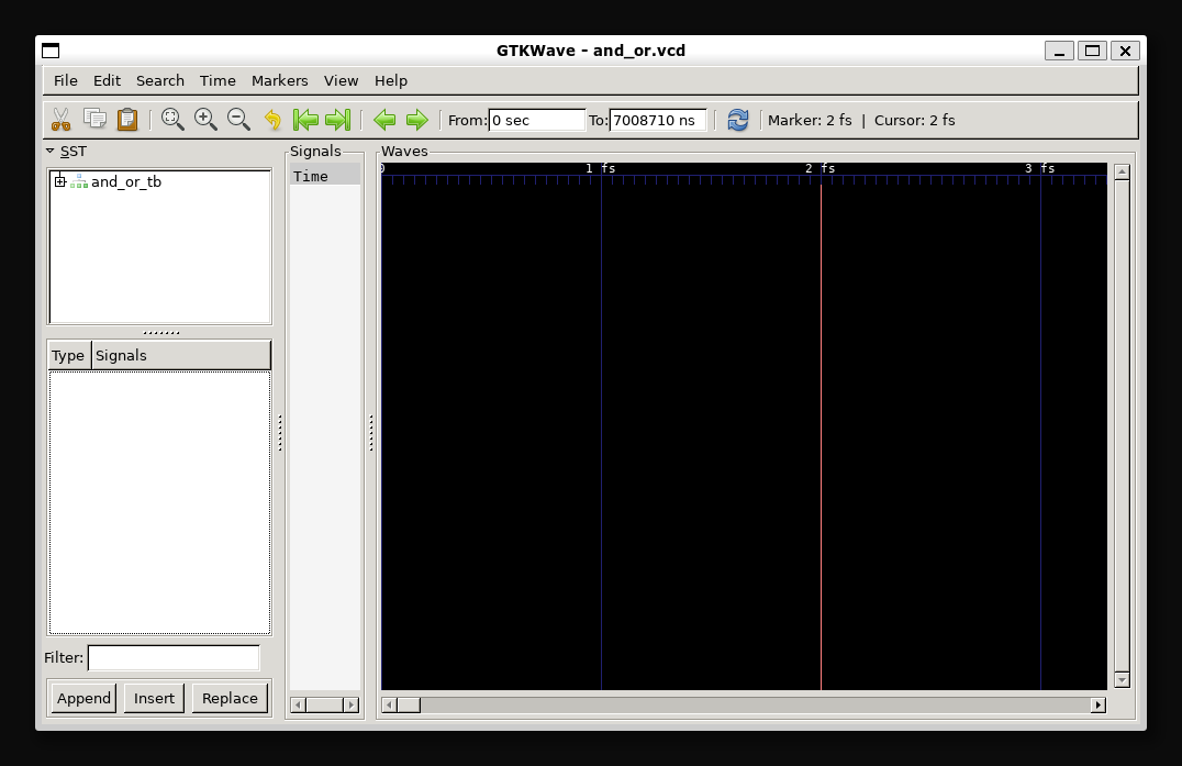
gtkwaveの使い方
gtkwaveの起動直後は画面上に波形は表示されていません。波形を表示するには以下の手順が必要となります。
- テストベンチを選択する
- 波形表示する信号を選択する
- 表示するタイミングを調整する
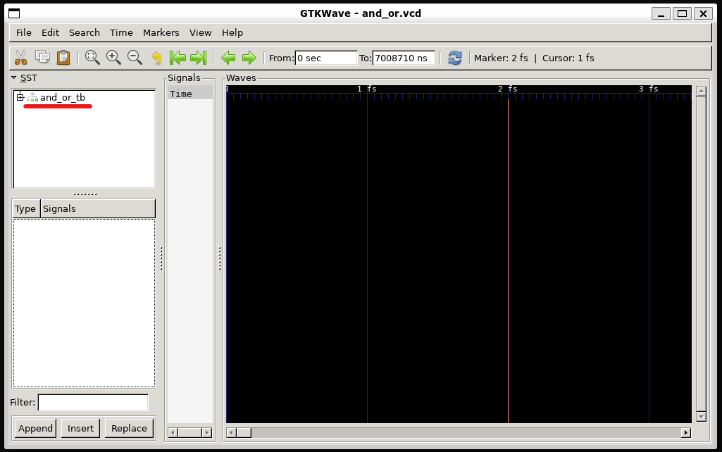
テストベンチを選択する
gtkwave左上のwindowからテストベンチを選択します。
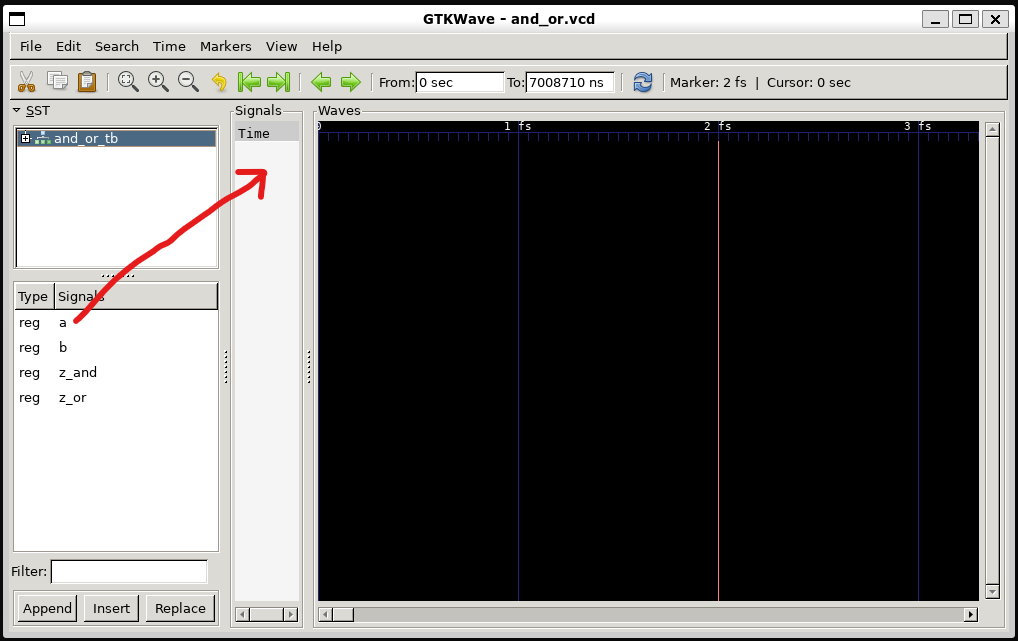
波形表示したい信号を選択する
テストベンチを選択すると、下のwindowに信号名が表示されます。 波形表示したい信号を隣にあるTimeのWIndowにドラッグアンドドロップします。
表示するタイミングを調整する
信号をドラッグアンドドロップすると波形が表示されます。ただし波形の表示タイミングが極めて狭いため信号の変化が見られません。 表示タイミングを調整するため、マイナスマークの虫メガネをクリックしましょう。

表示される時間範囲が長くなります。波形の変動が確認できるまで虫眼鏡マークをクリックしてみましょう。

まとめ
GHDLとgtkwaveを用いてVHDL学習用の環境を構築できました。
以上です。
AI勉強用、データの前処理
背景と目的
AIを勉強していると学習用のデータを準備するのが面倒とか難しいと思うことがあります。 画像データの準備方法とそれ用のスクリプトを作成したのでまとめておきます。
内容
本記事で行う内容は以下の通りです。
AIの勉強用途で用いる複数の有名人の画像データをgoogle-images-downloadで取得する。取得した画像データを人物毎に異なるディレクトリに保存します。
取得した画像データに対してAIで学習用データとして使用できるよう下記の処理を自作のpythonスクリプトで実行します。
- 顔部分を抽出
- 画像のピクセル数を統一する
- 白黒画像に変換する
自作のコードの大きな特徴として以下の2点があります。
- 一度のコマンドで複数のディレクトリに対して処理を実行する
- 画像データに複数の人物の顔が含まれている場合はAI用データとして使用しない(データの確認・削除の手間を省くため)
環境
本内容は、Windows11のWSLで実行しました。
特定の画像データを取得する方法
画像認識を行うにあたって、特定の人物、主に著名な有名人の顔画像のデータを多数あればいいのになぁと思うことがあります。そんなときはgoogle-images-downloadを使用すれば簡単にデータを取得できます。
google-images-download
google-images-downloadとは特定の検索ワードに引っかかる画像データを指定した枚数分だけ取得してくれる便利機能です。使うための前準備としては、2ステップで完了します。 まずは作業ディレクトリで以下コマンドを実行します。
git clone https://github.com/Joeclinton1/google-images-download.git gid-joeclinton
pip install -e gid-joeclinton
次に下記コマンドで取得したい画像を任意のキーワードから取得します。 'リンゴ'の画像を10枚取得する場合は、以下のコマンドを実行します。
googleimagesdownload -l 10 -k "リンゴ"
これで、作業ディレクトリの直下にdownloadsディレクトリが生成され、その中にリンゴの画像が10枚保存されたリンゴという名前のディレクトリが生成されます。
ちなみに-l 10は取得するデータ数を指定するもので、デフォルトでは100となります。上限も100となっています。
検索ワードとして複数のワードをカンマ区切りとすると、一度のコマンドで複数のワードのディレクトリが生成されそれぞれのディレクトリに各画像が保存されます。
AI用にデータを取得する
AI用のデータとしては異なる複数の人物の画像を取得します。下記のコマンドを作業ディレクトリで実行して今をときめく若手女優の画像データを取得しましょう。
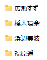
googleimagesdownload -k "橋本環奈,広瀬すず,浜辺美波,福原遥"
たったこれだけで今をときめく若手女優4名の画像がそれぞれ100枚取得できます。
A用にデータを調整する
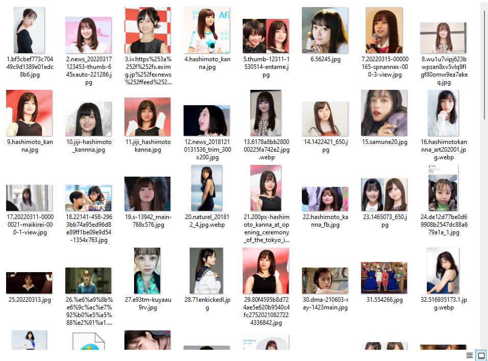
橋本環奈ディレクトリ内の画像は趣味として閲覧する分にはそれで十分ですが、AI用のデータとしては以下の点で不十分です。
- 顔以外の情報が含まれる
- 画像によって画素数が異なる
- カラー画像ではAI計算時の負荷が大きい
上記の対応(取得した画像データから顔部分だけをトリミング、画像の縦横のピクセル数を統一、白黒画像に変換)を行うスクリプトをpythonで作成しました。 本コードの特徴として以下の2点があります(再掲)。
1.一度のコマンドで複数のディレクトリに対して処理を実行する 1. 画像データに複数の人物の顔が含まれている場合はAI用データとして使用しない(データの確認・削除の手間を省くため)
本スクリプトは 作業ディレクトリ直下のdownloadsディレクトリに保存する前提で作成しています。ここではファイル名をtrim_images.pyとして話を進めます。
#!/usr/bin/python

import cv2
import os
from PIL import Image

output_size = 64 #Output image width and height

HAAR_FILE = './haarcascade_frontalface_alt2.xml'
cascade = cv2.CascadeClassifier(HAAR_FILE)

path = './'
contents = os.listdir(path)
direcs = [f for f in contents if os.path.isdir(os.path.join(path, f))]

for direc in direcs:
    path = './' + direc
    contents = os.listdir(path)
    files = [f for f in contents if os.path.isfile(os.path.join(path, f))]

    output_dir = './' + 'output_'+ direc
    if not os.path.exists(output_dir):
        os.mkdir(output_dir)

    index = 1
    for img_file in files:
        path = './' + direc + '/' + img_file
        img = cv2.imread(path, cv2.IMREAD_COLOR)
        try:
            img_g = cv2.cvtColor(img, cv2.COLOR_BGR2GRAY) #Convert to a gray scale image
        except:
            print('ERROR: ' + path)
            continue

        faces = cascade.detectMultiScale(img_g, minSize=(30,30))

        if len(faces) == 1:
            (x,y,w,h) = faces[0]
            if max(w, h) == w:
                trim = img_g[y+int((h-w)/2):y+int((h+w)/2), x:x+w]
            else:
                trim = img_g[y:y+h, x+int((w-h)/2):x+int((w+h)/2)]

            save_file = output_dir + '/' + 'no_' + str(index) + '.jpg'
            cv2.imwrite(save_file, trim)
            base_img = Image.open(save_file)
            resize_g = base_img.resize((output_size, output_size))
            resize_g.save(save_file)
            index += 1

    print(direc + ': ' +  str(index) + ' pics.')
作業ディレクトリに上記コードを作成し実行します。
実行するにあたってはdownloadsディレクトリにhaarcascade_frontalface_alt2.xmlを保存しておく必要があります。haarcascade_frontalface_alt2.xmlは以下のgithubからダウンロードするか内容をコピーして作成してください。
また、上記スクリプトを実行する際はopencvとpillowのインストールが必要です。それぞれ下記コマンドでインストールできます。
sudo pip3 install python-opencv
sudo pip3 install pillow
エラーが出た場合は下記コマンドでpipをupgradeし再度インストールを試みてください。
python3 -m pip install --upgrade pip
準備が済んだのちにtrim_images.pyを下記コマンドにて実行します。
python3 trim_images.py
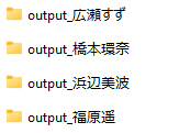
するとdownloadディレクトリ内に新たに4つのディレクトリが生成されます。
output_橋本環奈
output_広瀬すず
otuput_福原遥
output_浜辺美波
各ディレクトリを確認すると、いずれの画像も白黒でサイズが等しくなっていることがわかります。
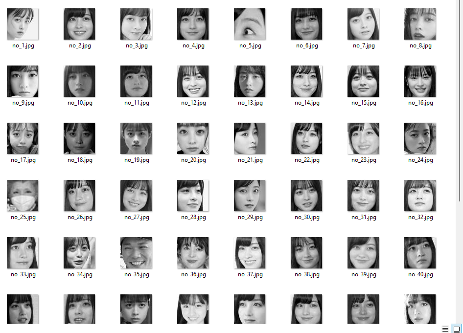
ただ残念なことに、google-images-downloadで取得したデータ自体に問題があり、異なる人物の顔画像や顔以外のものが顔として認識されて画像として保存されていることがわかります。手間ですが不要なデータはマニュアル操作で削除する必要があります。
まとめ
以下の2コマンドでありとあらゆる著名人のAI学習用画像が取得できるようになりました。
googleimagesdownload -k ""
python3 trim_images.py
これでAIの勉強が加速するはずです、多分。
以上です。
pyqt5でGUIアプリ開発
背景
ROS搭載ロボット用に開発した基板のデバッグ用アプリをVisual Studio 2019を使用していたが、 ROS開発環境があるならpyqt5で開発した方が便利・楽であると考えたので簡易なアプリを開発してみた。 備忘録として記録を残す。
開発したもの
開発したアプリは非常に単純なもので、入力欄とボタンがあり、ボタンを押下すると対応した入力欄の数値を既定のtopicにpublishするものである。 成果物は以下。

スクリプト
スクリプトは以下。
#!/usr/bin/python

import rospy
from PyQt5.QtWidgets import QApplication, QWidget, QPushButton, QGridLayout, QLabel, QLineEdit
from std_msgs.msg import String
from std_msgs.msg import UInt16
from std_msgs.msg import Int16MultiArray

pub_string = rospy.Publisher('topic_string', String, queue_size = 1)
pub_int = rospy.Publisher('topic_int', UInt16, queue_size = 1)
pub_array = rospy.Publisher('topic_array', Int16MultiArray, queue_size = 1)

def on_string_btn_clicked():
    pub_string.publish(string_input.text())

def on_int_btn_clicked():
    pub_int.publish(int(int_input.text()))

def on_array_btn_clicked():
    array = [int(array_input1.text()), int(array_input2.text())]
    data_array = Int16MultiArray(data = array)
    pub_array.publish(data_array)

if __name__ == '__main__':
    app = QApplication([])
    window = QWidget()
    window.setWindowTitle('QGridLayout')

    label_string = QLabel('Enter String')
    string_input = QLineEdit('')
    btn_string = QPushButton('Publish String')
    btn_string.clicked.connect(on_string_btn_clicked)

    label_int = QLabel('Enter Int')
    int_input = QLineEdit('')
    btn_int = QPushButton('Publish Int')
    btn_int.clicked.connect(on_int_btn_clicked)
    label_array1 = QLabel('Array1')
    array_input1 = QLineEdit('')
    label_array2 = QLabel('Array2')
    array_input2 = QLineEdit('')
    btn_array = QPushButton('Send Array')
    btn_array.clicked.connect(on_array_btn_clicked)

    layout = QGridLayout()

    layout.addWidget(label_string, 0, 0)
    layout.addWidget(string_input, 0, 1)
    layout.addWidget(btn_string, 0, 2)
    layout.addWidget(label_int, 1, 0)
    layout.addWidget(int_input, 1, 1)
    layout.addWidget(btn_int, 1, 2)
    layout.addWidget(label_array1, 2, 0)
    layout.addWidget(array_input1, 2, 1)
    layout.addWidget(label_array2, 3, 0)
    layout.addWidget(array_input2, 3, 1)
    layout.addWidget(btn_array, 2, 2, 2, 2)

    window.setLayout(layout)
    window.show()

    rospy.init_node('pub_test', anonymous=True)

    app.exec_()
成果物
成果物を再掲。

VHDL文法一覧
背景
VHDLの学習として文法などをまとめてみた。間違いや最新情報のキャッチアップは出来ていない可能性あり。 コメント頂ければ幸い。
論理合成に関するもの
ライブラリ宣言
library IEEE;
use IEEE.std_logic_1164.all;        -- 基本関数
use IEEE.std_logic_unsigned.all; -- 符号無し演算関数
use IEEE.std.logic_arith.all;    -- 算術演算関数
モジュール
モジュールと入出力ポートの宣言
entity MODULE is
    port (
               A : in    std_logic;
               B : in    std_logic_vector(7 downto 0);
               C :out   stdlogic);
end MODULE;
内部配線の宣言
signal D : std_logic;
アーキテクチャ
architecture RTL of MODULE is begin
 ・
 ・
 ・
end RTL;
ポート宣言
port(名前 :入出力 信号線種類);
入出力
in/out:inout
信号線の種類
ビット線
A : std_logic
バス線
A : std_logic_vector(7 downto 0);
モジュール内部信号
signal A : std_logic_vector( 7 donwto 0);
定数宣言
constant A : std_logic := '0'; --定義的な使い方
変数宣言
variable A : std_logic := '0'; --テストベンチ用
ジェネリック
generic(
    COUNT : integer := 4
);
-- パラメーターとして使用する
タイプ
列挙タイプ
type state is (
    idle,
    start,
    stop
);
Integerタイプ
type digit is integer range 0 to 9;
サブタイプ
subtype IOBUS is std_logic_vector(7 dwonto 0);
subtype DIGIT is interger range 0 to 9;
配列
type WORD is array(1 to 8) of std_logic;
type WORD is array(integer 1 to 8) of std_logic;
多次元配列
type memory is array(0 to 5, 7 downto 0) of std_logic;
プロセス文
process (CLK) begin
    if rising_edge(clk) then
       A <= B;
    end if;
end process;
if文
if 条件 then
elsif 条件 then
else
end if;
when文
A <= B when E = 1 else
     C when F = 1 else
     D;
case文
case A is
    when "00" => B <= "000";
    when "01" => B <= "010";
    when "10" => B <= "100";
    when others => B <= "000";
end case;
センシティビティリスト
process (A,B,C) begin
    A <= B and C;
    C <= A or B;
end process;
入力全てをセンシティビティリストにする場合
process (all) begin
end process;
クロック
process (clk) begin
    if rising_edge(clk) then
    -- 処理
    end if;
end process;
-- 立下りはfalling_edge(clk)
連結
C(4 down to 1) <= A(0) & B( 3 downto 1);
ビット抜出し
A(0) --Aの1bit目の値
B( 3 downto 1) --Bの4,3,2bit目の値
数値の表記方法
bit表示; '0'
binary表示: "0010"
Hex表示: X"FF08"
モジュール階層化
entity MODULE is
    port(
    --
    );
end MODULE;
architecture RTL of MODULE is
component comp
    port (
    -- compモジュールの入出力ポート
    );
end component;

signal D : std_logic;
begin
    c1: comp port map(A, B, C); -- entityポートの表示順に対応
end RTL;
ROS覚書
背景
ROSを使ってロボット開発をしていると似たようなものを繰り返す使う羽目になるのでここにまとめる。 現在ROS1とROS2があるが、ここではROS1に限定して述べる。
ROS概要
ROSとはROSはRobot OSの略。ただし実際にはOSではなくコンピューターとハードウェアをつなぐミドルウェアのようなもの。ROSを使うことでロボットのハードウェアを抽象化でき、パートごとの開発・アップデートが容易になる。
ROSを使う理由
多くのロボット開発でROSが使用されている。その理由として以下があげられる
- 完全無料
- 市販のセンサーがROSに対応済
- 分散型システムの構築が容易
- 便利機能が色々
完全無料
ROSはオープンソースで完全無料で使用可能である。
市販のセンサーがROSに対応済
ロボットに搭載するLiDARセンサーやカメラ、IMUモジュール等の多くでROS用のPackageがリリースされており、ROSで開発されたロボットシステムで使用するには簡単なコマンドを打つだけというお手軽仕様である。
分散型システムの構築が容易
ROSを用いたシステムは、Nodeと呼ばれる小単位で構成される。Nodeを各ハードウェアの機能に対応させることで各ハードウェア毎の開発を完全に切り分けて行うことが可能である。
便利機能が色々
ROSにはロボットのセンサーデータを可視化するRVIZ、シミュレーションを行うGazebo、自己位置推定や自律移動が可能なAMCL/MoveBaseといったパッケージが準備されている。これらの既存の機能を活用することで市販のメインPCとセンサーとモーター等を購入し接続するだけで自己位置推定が可能な自律移動ロボットを簡単に開発できる。
ROSの構成
ROS開発は以下の構成で行われる。 Workspace > Package > Node 一つのマシンには一つのWorksapceがあり、一つのWorksapceに複数のPackageがあり、一つのPackageに複数のNodeがある。

ROSを始めるには
ROSを始めるにあたっては以下順次行う必要がある。
- ROSのインストール
- Workspaceの作成
- Packageの作成
- Nodeの作成
それぞれの手順・コマンドを以下に記載する。
ROSのインストール
ここではROSのmelodicをインストールする前提で説明を行う。 ROSのインストールは本家の説明の通りに実行すればよい。 wiki.ros.org 推奨設定としてコマンドを以下に記載する。
sudo sh -c 'echo "deb http://packages.ros.org/ros/ubuntu $(lsb_release -sc) main" > /etc/apt/sources.list.d/ros-latest.list'
sudo apt install curl # if you haven't already installed curl
curl -s https://raw.githubusercontent.com/ros/rosdistro/master/ros.asc | sudo apt-key add -
sudo apt update
sudo apt install ros-melodic-desktop-full
echo "source /opt/ros/melodic/setup.bash" >> ~/.bashrc
source ~/.bashrc
sudo apt install python-rosdep python-rosinstall python-rosinstall-generator python-wstool build-essential
sudo apt install python-rosdep
sudo rosdep init
rosdep update
Workspaceの作成
Worksapceは以下のコマンドで行う。
mkdir -p ~/catkin_ws/src
cd ~/catkin_ws/src
catkin_init_workspace
cd ~/catkin_ws
catkin_make
lsコマンドでcatkin_wsディレクトリ下にbuildディレクトリとdevelディレクトリが生成されていることが確認できる。

Packageの作成
Packageは以下のコマンドで作成する。 ここではPackageの名前をpkg_nameとした。
cd ~/catkin_ws/src
catkin_create_pkg pkg_name std_msgs roscpp rospy
lsコマンドでsrcディレクトリ下に以下にpackage_nameディレクトリが生成されていることが確認できる。
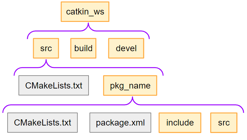
Nodeの作成
NodeはC++またはPythonで記述することになる。 Node作成の前にPackageの中身を確認してみる。
cd ~/catkin_ws/src/pkg_name
lsコマンドでCMakeLists.txt、package.xml、srcディレクトリ、includeディレクトリが生成されていることが確認できる。 NodeをC++で記述する場合はsrcディレクトリに移動しソースコードを作成する。 Pythonで記述する場合はscriptsディレクトリ内にスクリプトを作成する必要がある。デフォルトではscriptsディレクトリはないため新規にscriptsディレクトリを作成する必要がある。
cd ~/catkin_ws/src/pkg_name
mkdir scripts
早速Nodeを作成したいところだが、はやる気持ちを抑えてもう少しNodeについて理解深めよう。
Node間の通信3種類
ROSシステムは多くの小単位Nodeで構成されており、各Node間でデータがやり取りされてシステム全体として機能している。
Node間のデータのやり取りの方法は3種類ある。Topic、 Service、Actionである。

Topic
Publisherは任意のTopicに任意のMessageを発行する。Subscriberは任意のTopicにMessageが発行されたことを受けて任意の処理を実行する。一般的にはPublisherのMessage発行タイミングは周期的に行われる。

Service
Service ClientがService ServerにRequestを送信する。Service ServerはRequestを受けて任意の処理を行いResponseを返送する。

Action
Action ClientがAction ServerにGoalを送信する。ServerはGoalを受けて任意の処理を行い、その過程で随時FeedbackをActionClientに返送する。一連の処理が完了するとAction ServerがActionClientにResultを送信する。

Nodeの動きを把握する
Nodeの動きを把握するために実際にROSを動かしてみよう。
ROSシステムを起動する手順を以下に示す。
- roscoreコマンド
- rosrunコマンドで各パッケージの各ノードを起動
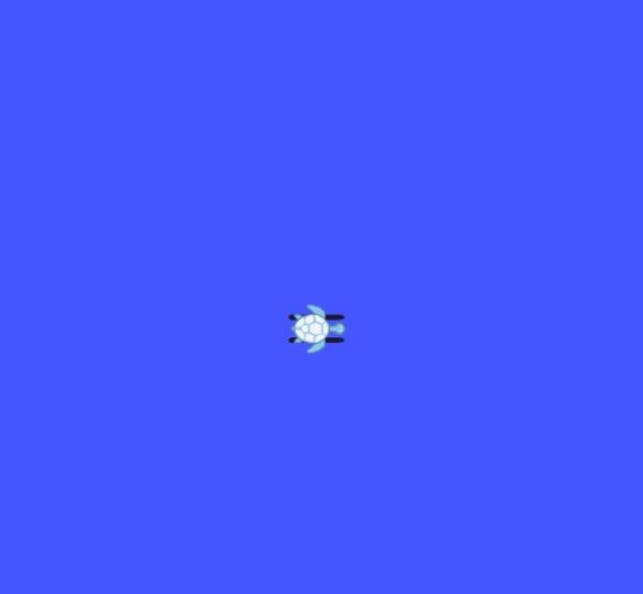
亀を動かす
ROSのチュートリアルとして用意されている亀を動かしてみよう。 ターミナルを立ち上げて以下コマンドを実行する。
roscore
別のターミナルを立ち上げて以下コマンドを実行しturtlesimパッケージのturtlesim_node ノードを起動する。
rosrun turtlesim turtlesim_node
画面上に亀が表示される。
rosrun turtlesim turtle_teleop_key
これでキーボード操作で亀が移動するようになる。 亀が動いている裏で、 - turtle_teleop_keyノードがキーボードの入力情報を特定のtopicにpublishする - turtlesim_nodeノードが特定のtopicをsubscribeする が行われている。実際にデバッグ機能を用いて各Node間のつながりを確認してみる。 ターミナルをさらに立ち上げて以下のコマンドを実行するとNode間のつながりが確認できる。
rosrun rqt_graph rqt_graph
以下が表示される。楕円に囲まれた文字がNode名であり、楕円をつないだ線上の文字がTopic名である。

ソースコードの例
Nodeについて多少理解が深まったと思われるのでNodeやTopic/Service/Actionを指定するソースコードを以下に例示する。
Topicの場合
記述方法は様々だが、ここではClassを使用して一つのコードにPublisherとSubscriberを記述した例を記載する。
C++
Node名"talker"、pub_topicにpublish、sub_topicをsubscribeする場合のコード例は以下の通り。
#include "ros/ros.h"
#include <std_msgs/String.h>
class Talker{
private:
    ros::NodeHandle nh;
    ros::Publisher pub = nh.advertise<std_msgs::String>("/pub_topic", 1);;
    ros::Subscriber sub = nh.subscribe("/sub_topic", 1,  &Talker::callback, this);
    std_msgs::String pub_msg;

public:
    NodeTestClass(){
        ros::Rate loop_rate(1);
        while(ros::ok()){
            publication();
            ros::spinOnce();
            loop_rate.sleep();
        }
    }
    void publication(){
        pub_msg.data = "Hello world";
        pub.publish(pub_msg);
    }

    void callback(const std_msgs::String::ConstPtr& msg){
        std::cout << msg->data.c_str() << std::endl;
    }
};
int main(int argc, char**argv){
    ros::init(argc, argv, "talker");
    Talker talker;
}
Python
#!/usr/bin/python
import rospy
from std_msgs.msg import String

class Talker():
    def __init__(self)
        rospy.init_node('talker')
        self.pub = rospy.Publisher('pub_topic', String, queue_size=1)
        self.sub = rospy.Subscriber('sub_topic', String, callback)
    loop_rate = rospy.Rate(1)

    while not rospy.is_shutdown():
        self.publication()
        loop_rate.sleep()

    def publication(self):
        msg = 'Hello World'
        self.pub.publish(msg)

    def callback(self, msg):
        rospy.info(msg)

if __name__ == '__main__':
    talker = Talker()
Serviceの場合
Actionの場合
自作Nodeを起動するには
C++でNodeを自作した場合は起動前にビルドする必要がある。 ビルドの下準備としてPackage直下のCMakeLists.txtに作成したソースコードのファイル名やNode名などを記載する必要がある。 例えば、ファイル名 talker_class.cppで記述したNode名"talker"を起動したい場合は、Package直下のCMakeLists.txtの以下add_executableとtarget_link_librariesを下記のように記述する。
add_executable(talker src/talker_class.cpp)
target_link_libraries( talker ${catkin_LIBRARIES} )
CMakeLists.txtを修正したら、catkin_wsディレクトリ下でコマンドcatkin_makeを実行する。
cd ~/catkin_ws
catkin_make
エラーが表示されなければビルドは成功である。
Messageの型を自作する
上記ソースコード例では既存のMessageの型であるString型を使用している。デフォルトでいくつかの型は準備されている。Topicの場合は下記URLを参照。 http://wiki.ros.org/std_msgs
Messageの型は自作することも可能である。自作する場合は、Packageディレクトリ直下にmsgディレクトリを作成し、msgディレクトリ内にname.msgというファイルを作成する。 例えば、人の名前(String)と年齢(Uint8)と性別(Bool, maleがtrueかfalseか)をひとまとめにしたMessageを取り扱う場合は下記のファイルを作成する。
String name
Uint8 age
Bool male
ファイル名はPerson.msgとでもしておき、msgディレクトリに保存しておく。 自作したMessageを使用するはCMakeLists.txtに登録する必要がある。
find_package(catkin REQUIRED COMPONENTS
    roscpp
    rospy
    std_msgs
    message_generation
)

add_message_files(
    FILES
    Person.msg
 )

generate_messages(
    DEPENDENCIES
    std_msgs
)
Serviceの型を自作する
Message同様Serviceの型も自作可能である。Service方はPackage直下にsrvディレクトリを作成し、ディレクトリ内にname.srvファイルを作成する。 Serviceはrequestとresponseが必要であることから下記のような記述内容となる。
String name
---
Uint8 age
Bool male
'---'でrequestとresponseを分けている。上記の例ではServie Clientがnameでrequestし、Service Serverがageとmale(性別、trueなら男)を返す記述例である。 Serviceファイルを新規作成した際もPackage直下のCMakeLists.txtを修正する必要がある。
find_package(catkin REQUIRED COMPONENTS
    roscpp
    rospy
    std_msgs
    message_generation
)

add_service_files(
    Person.srv
)

generate_messages(
    DEPENDENCIES
    std_msgs
)
Actionの型を自作する
MessageとService同様Actionの型も自作可能である。ActionはPackage直下にactionディレクトリを作成し、ディレクトリ内にname.actionファイルを作成する。 Serviceはrequestとresponseが必要であることから下記のような記述内容となる。
String meal
---
Bool done
String comment
---
UInt8 progress
'---'でgoalとresultとfeedbackを分けている。上記の例ではAction Clientがmeal(どの食事を作るか)でgoalを示しAction Serverが途中経過をprogress(現在何%出来上がった)で返送しつつ、最終的にdone(完成した)とcomment(メモ)をresultとして送る記述例である。 Actionファイルを新規作成した際もPackage直下のCMakeLists.txtを修正する必要がある。
find_package(catkin REQUIRED COMPONENTS
    roscpp
    rospy
    std_msgs
    message_generation
)

add_action_files(
    Meal.action
)

generate_messages(
    DEPENDENCIES
    std_msgs
    actionlib_msgs
)
デバッグ機能いろいろ
ROSを活用する上で便利なデバッグ機能を以下に記載する。
rqt_graph
ターミナルで以下コマンドを実行すると、Nodeとその通信の一覧が図示される。
rosrun rqt_graph rqt_graph
Topicなどを一覧表示
ターミナルで以下コマンドを実行すると、Topic一覧が表示される。
rostopic list
Node一覧を見る場合は以下のコマンドを打つ。
rosnode list
ターミナルからpublish
作成したNodeの動作確認目的などで特定のmessageをpublishしたい場合がある。その都度デバッグ用のNodeを作成する必要はなくrotopic pub コマンドでmessageをpublishできる。 例えばTopic名"/topic"にString型の"Hello World"をpublishしたい場合は以下のコマンドを実行すればよい。
rostopic pub -1 /topic std_msgs/String "Hello World"
ターミナルでsubscribe
特定のTopicのmessageをsubscribeしたい場合もわざわざ専用のNodeを作成する必要はない。 例えばTopic名"/topic"のmessageを確認したい場合は以下のコマンドを打てばよい。
rostopic echo /topic
RVIZにデータを表示
自作したセンサ基板で取得したデータをRVIZに表示する方法を記載する。
下記のMaker型のmarker_dataを作成しMarker型で任意のTopicにpublishするだけでRVIZ上でMarkerが表示可能となる。
marker_data = Marker()
marker_data.header.frame_id = "map"
marker_data.header.stamp = rospy.Time.now()
marker_data.type = marker_data.SPHERE
marker_data.action = Marker.ADD

marker_data.pose.position.x = 0.0
marker_data.pose.position.y = 0.0
marker_data.pose.position.z = 0.0

marker_data.pose.orientation.x = 0.0
marker_data.pose.orientation.y = 0.0
marker_data.pose.orientation.z = 0.0
marker_data.pose.orientation.w = 0.0

marker_data.color.r = 1.0
marker_data.color.g = 1.0
marker_data.color.b = 1.0
marker_data.color.a = 1.0

marker_data.scale.x = 0.05
marker_data.scale.y = 0.05
marker_data.scale.z = 0.05

marker_data.lifetime = rospy.Duration()
marker_data.typeはRVIZ上に表示するMarkerの形状を決めるもので、球体以外にも矢印(ARROW)や立方体(CUBE)などがある。 marker_data.pose.position.x/y/zはMarkerが表示される位置を示すもので、データに応じて変更すればよい。 marker_data.pose.orientation.x/y/z/wはMarkerの向きを示すもので、球体の場合は不要、矢印の場合は適切な方向を定める必要がある。 marker_data.color.r /g/b/aはMarkerの色を決めるものである。いずれもデフォルトでは0(黒色、透明)なため適当な数値を設定しておく。 marker_data.scale.x/y/zはMarkerのサイズを決めるものである。
pyqt5でGUIツールを作成
デバッグ効率化のためにGUIツールをpyqt5で開発する方法を下記に記載した。
Linuxのコマンド
Pythonスクリプトの実行やUSBデバイスの使用時にエラーが発生した場合の対処法を記載する。
Pythonスクリプトを実行する場合
sudo chmod +x script.py
USBデバイスを使用する場合
USBデバイスのCOMポートが/dev/ttyUSB0の場合
sudo chmod 666 /dev/ttyUSB0
Windows11でROS開発
WindowsでもWSLを用いる事で容易にROSの開発環境を構築できるようになった。特にWindoows11ではGUIのために必要であったVcXsrvのインストールが不要となった。ここではWindows11でROS開発環境を構築する方法を記載する。
Ubuntuのインストール
MS StoreからUbuntu18.04をダウンロード・インストールする。
ROSとGUI環境のインストール
検索ボックスにWSLと入力しWSL(Ubuntu)を実行する。 立ち上がったUbuntuで以下コマンドを実行する。
sudo apt install x11-apps -y
完了後に以下コマンドを実行し別windowに目が表示されればGUI環境の構築は完了。
xeyes

ROSのインストールは本記事の" ROSのインストール"を参照。
USBデバイスの認識
USBデバイスをUbuntu側で使用する方法を記載する。 Ubuntu側で以下を実行する。
sudo apt install linux-tools-5.4.0-77-generic hwdata
sudo update-alternatives --install /usr/local/bin/usbip usbip /usr/lib/linux-tools/5.4.0-77-generic/usbip 20
WindowsPCにUSBデバイスを接続した状態でpoweshell管理者モードで以下コマンドを実行し接続したUSBデバイス情報(busid)を把握する。
usbipd wsl list
上記で取得したbusidを用いて下記コマンドを実行する。
usbipd wsl attach --busid <busid>
テレワーク用のデバイス開発
背景
テレワークOKは風潮が進み会社に設備があるにも関わらず家で働くことが増えている。
しかし会社の設備を誰かが対応する必要性にかられることがある。
特に多いパターンは正常に動作しない機器の主電源のOn/Off。
ここでは主電源、特にAC電源のOn/Off可能なデバイス開発を検討する。
検討事項
家から遠隔で職場のAC電源をOn/Offするにはどうすればよいか。
AC電源を遠隔でOn/Offするのが一番てっとり早い。
例えばデスクトップPCはAC電源On/Offだけでは再起動しないため、別途電源ボタンを押下するデバイスが必要となるが、
今回は無視して考える。
実現方法
遠隔でデバイスを操作するにはLTE通信モジュールが必要。
候補はSakura.ioのLTEモジュール。
本モジュールを使えば極めて安価で遠隔地のGPIOの制御が可能となる。
構成
AC電源━[ACスイッチリレー]━出力
[SakuraIOモジュール]┛
上記が基本構成だが、デバイスの動作確認のため環境センサ(主に温度センサ)と電圧・電流検出が必要となる。
SakuraIOモジュールに供給する電源は、AC電源からDC電源を生成してもよいが、
ACコンセントから電源が抜けた場合に電源供給できない原因が何かを把握する目的で乾電池とした方がよい。
応用例
本デバイスはテレワークだけでなく、カスタマーサポートの手間を減らす目的でも使用できる。
カスタマーサポートに寄せられる内容で主電源が抜けていることが原因の事象が多い。
電源が抜けているかどうかを確認するにあたっていちいち確認をしてもらうまでもなく現在の状況をサポートサイドで確認できるのはメリットがある。